
Love it or hate, dark mode appears here to stay. In fact, industry estimates show that one-third of emails (34%) are opened in dark mode. (You can read more about the fundamentals of dark mode in a previous installment of this series.)
 Though popular with users, dark mode presents some initial barriers for designers and developers. Maintaining sufficient contrast for readability generally—and particularly to meet established contrast and color standards (e.g., WCAG 2) for those experiencing visual disabilities—can be more difficult. While almost all colors can work against a white background, the options are greatly reduced for what will work against a dark backdrop.
Images are particularly challenging in dark mode. In a recent poll, 43% of respondents reported trouble optimizing logos and images for dark mode emails.
Still, developers can turn the challenges of dark mode into opportunities to experiment. Some email clients allow you to designate alternate images for dark mode. It’s a simple and effective solution.
Why swap out images in dark mode?
Creative teams may request different images (or image crops) for desktop and mobile devices in an HTML email, separate images and sections that we treat as images—logos, headers, and footers—can be designated for dark mode in some email clients.
Typically, logos, headers, and footers are created for the standard display option: i.e., light mode. When an email with elements designed for light mode is presented in dark mode, its images remain light. That can mean an aesthetically compromised user experience that no longer meets brand standards.
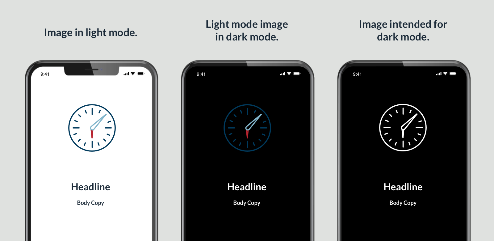
In Apple Mail and Microsoft Outlook, swapping images intended for light mode for options that work well in dark mode helps create a more consistent user experience whichever display mode the user prefers.
Tutorial: How to swap images
Apple Mail
First place these meta tags in the HTML outside of the style tag:
<meta name="color-scheme" content="light dark">
<meta name="supported-color-schemes" content="light dark">
The HTML will have two images: one for light mode and one for dark mode. The dark-mode image will get a CSS class of “.image-swap-dm.” The light mode image will get a CSS class of “.image-swap-lm.” In the CSS, place the pseudo-class “:root” tag with color-scheme property in it like this:
:root  {

   color-scheme: light dark;

   supported-color-scheme: light dark;

   }
With this, the light-dark value will align with the device settings—whether in light mode or dark mode.
Next, add some CSS to keep the dark mode image hidden when the email is in light mode.
.image-swap-dm  {

       display: none !important;

  }
 .image-swap-lm {
 display: block !important;**
 }
Finally, add the “@media prefers-color-scheme: dark.” This is specific to Apple Mail’s WebKit and no other email clients.
@media (prefers-color-scheme: dark) {.image-swap-dm {
display: block !important;
}
.image-swap-lm {
display: none !important;
}
}
Within the @media block, swap the style declarations for each class. The “ display: none;” declaration makes the image disappear and “display: block;” makes the image appear.
Outlook
Utilizing the original CSS of hiding the dark-mode image we can add this to the CSS. Note, this [data-ogsc] code snippet may look strange, but it makes sense to the rendering engine for the Outlook.com client.
[data-ogsc] .image-swap-dm {

      display: block !important;

    }
 [data-ogsc] .image-swap-lm {
 display: none !important;
 }
For visibility, add a Microsoft conditional statement to hide the dark-mode image in Microsoft Outlook clients. Conditional statements are only recognized by Outlook and were created by Microsoft to deal with the email clients that are using Microsoft Word for a rendering engine. The rendering engine doesn’t recognize the CSS hiding and showing the images for dark mode. One way to handle this is to hide the dark-mode image in a statement below.
<!--[if !mso]><! -->

  <dark mode image>

   <!--<![endif]-->
A limited solution
A major caveat for this solution of switching out images in dark mode is that not all email clients can be affected by using code. That leaves us with some clients that won’t do the image swap.
The main issue is the variations in the email clients. With some email clients, we don’t know “what’s going on under the hood” when it parses the HTML email. Additionally, the syntax for the image swap in Apple Mail and Outlook.com is in the CSS. Some email clients don’t accept CSS or offer very limited CSS acknowledgment in their rendering engine.
Email developers will likely keep needing to find solutions to address the challenges of two display modes with such different needs. But given today’s available tools, swapping light-mode images for options made with dark mode in mind is a pretty effective trick for two of the most common email clients.
Ed Ball is a front end developer for The Lacek Group, a Minneapolis-based data-driven loyalty, experience, and customer engagement agency that has been delivering personalization at scale for its world-class clients for more than 30 years. The Lacek Group is an Ogilvy company.

Will your Loyalty Program Pay Off?
December 20, 2023
Applying Advanced Analytics to Enhance and Retain Customer Loyalty
June 16, 2020
Harmonizing Psychology and Marketing: Forging Deeper Connections with Customers
November 14, 2024
Riffing Out Loud: AI and Infinite Personalization
February 11, 2025
Riffing Out Loud: The Credit Card Competition Act of 2023
May 22, 2024
Riffing Out Loud: For Brands, Perception Is Reality
March 20, 2024
For Right-Brained People, We Drew A Picture. For Left-Brained People, We Wrote A Report.
May 4, 2022
Brand Ambassadors Go Where Your Brand Can't
August 15, 2024-1.jpg)
Communities Rally for Brands that Help Others
April 17, 2020